Case Study: Credit Recovery for Apex Learning
Information design for online learning
Apex Learning was adding a new feature to their online courses where a student could take a pretest at the beginning of a unit and be able to test out of parts of the unit. They wanted some type of indicators in the course outline showing students which activities they were assigned and which they had tested out of.
Challenge: Marking a clear path in a constrained space
The existing course outline was difficult to scan and had extra design elements that were attempting to clear things up, but just added noise. In addition, because of the limited scope of this project, we were very constrained in what we could change. We could make formatting changes to the outline text, but the outline area had to stay the exact same size, and none of the outline text could change in content or structure.
Approach: Clean up, prepare the student, and have a fallback plan
I recommended a wider view to solving the issue. First, clean up the course outline to provide a clear canvas and then add the assigned/tested-out indicators. Next, provide support outside of the small course outline by visually tying the pretest results page to the outline indicators and by providing fallback warnings in case a student missed or misunderstood an indicator.
Outcome: Tested well and (about) ready to launch
Paper prototype testing showed most people understood the indicators when they first appeared, and the fallback warnings caught the rest, keeping them from doing unnecessary work. This new feature should launch this Spring.
Roles
- User Experience Architect
- Usability Tester
- Information Designer
The Course Outline
Most of the work of indicating which activities the student still needed to do fell on the course outline, which was always visible and was the only way to navigate from one activity to another.
SCOPE CONSTRAINTS: There were a lot of things I wanted to change about this outline, but the scope of this project was very narrowly defined. We couldn’t touch the outline container itself, the content of the outline, or how students interacted with it. We could only add assigned and/or tested-out indicators, and making formatting changes to the existing outline items.
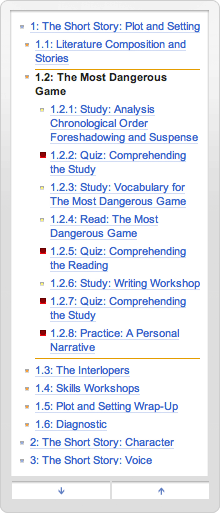
Existing Course Outline
The structure of the existing outline was not very crisp, and the bullets and boxes made it difficult to add more indicators in this small space.
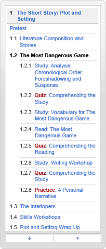
Cleaned Up
I removed unnecessary pixels and used reinforcing visual elements to make the outline easier to scan and read.
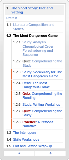
With Indicators
After exploring many options, we went with a narrow indicator, emphasis on assigned items, and slightly grayed-out text for tested-out items.
When we showed the outline by itself, the assigned indicators weren’t immediately clear to most people who saw it, but it didn’t need to be clear all by itself. We used the pretest results page to introduce the outline indicators, and we provided fallback warnings in case a student missed or misunderstood an indicator.
Introducing the Outline Indicators
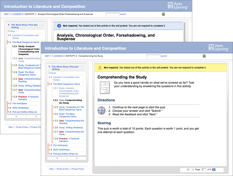
Once the student finished the pretest, they would see a results page in the main content area. I designed this to reflect the formatting used on the course outline, to help students make the connection.

Fallback Banners
For activities the student tested out of, we added a fallback banner at the top of the first page of content for that activity, in case the student ended up there by mistake or misunderstanding. For instruction activities, it was a blue informational note, and for graded activities, a more noticeable yellow warning.
Leave a Reply
Want to join the discussion?Feel free to contribute!