Case Study: T-Mobile DIGITS
T-Mobile was creating a new service to allow multiple phone lines to be used on one or more devices at once. They needed help designing the iOS (my focus) and Android apps their customers would use.
Challenge: Big, complex, and in a hurry
We were working on a very short deadline on this large, complex project. We had as many as 14 designers, most of whom were junior, split into iOS and Android teams. The development would happen later offshore, so we needed to be extra thorough in our documentation.
Approach: Research, consistency, and teamwork
We wanted the experience to be as familiar as possible for users. On the iOS team, we built on the existing iOS experience and blended in T-Mobile branding and customer insights. We encouraged iOS and Android designers to communicate with their counterparts working on the same scenarios for cross-platform consistency. And while my team lead focused on feature definition and design reviews, I provided day-to-day design mentorship for junior UX designers.
Outcome: A solid foundation, ahead of schedule
We completed the version 1 design for iPhone and Android phones on time in two-and-a-half months as well as MVP candidates for the tablet versions of both operating systems, which were not initially in scope. T-Mobile DIGITS launched in May 2017 and T-Mobile is continuing to expand on the base we designed.
My Roles
- User experience designer
- Visual designer
- Design mentor
Creating a familiar experience
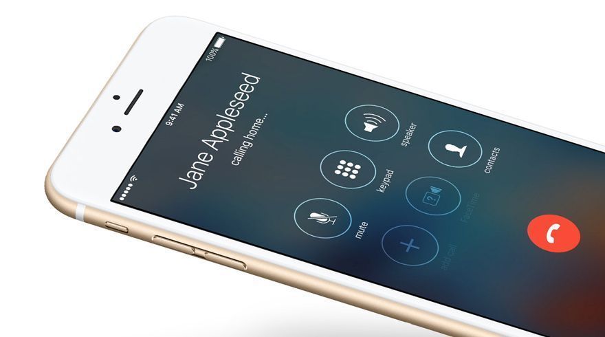
Most of the iOS app involved extending often-used parts of the existing iOS UI, such as phone and messaging. We researched Apple’s Human Interface Guidelines and the recently release iOS 9 experience to make things as familiar as possible. We then blended in T-Mobile branding to ensure users could easily tell if they were in the DIGITS app or the native iOS app.
We also worked with T-Mobile product teams to get customer telemetry data to enhance the experience for our target audiences. For instance, information on call volume trends for business customers led us to place more design emphasis on handling large volumes of calls at once.
Designing complex flows with a large team
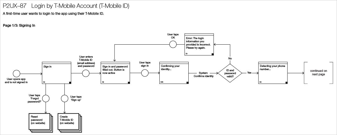
We designed flows for all needed scenarios, including relevant exception handling. With the most experience on the iOS team, I focused on the more complex flows around signup/login and handling multiple calls. With large teams of designers and developers, it was important to be very standardized and organized in our flow diagrams.
Designing screens with new features and new form factors
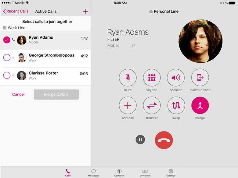
We designed screens for both the iPhone and iPad. Many screens were based on existing iOS phone and messaging design, enhanced to accommodate multiple lines working on one device. Our goal was an experience that felt comfortable and familiar while exposing this new functionality with T-Mobile branding.
For the iPad, we looked at how we could use the extra screen space to enhance the phone call experience for business users who would often have multiple calls at once across multiple phone lines.
Documenting Accessibility Requirements
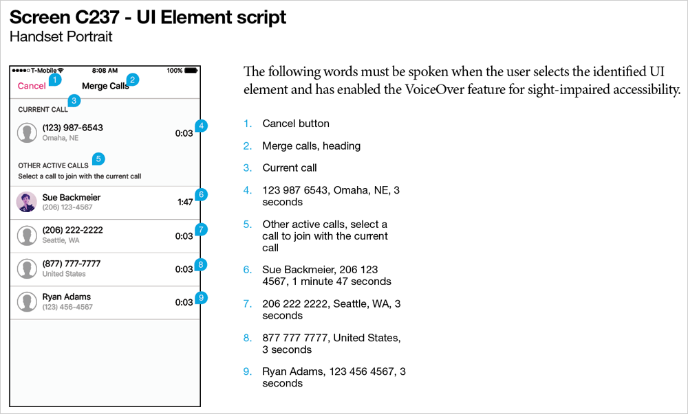
The app had to meet accessibility standards. In addition to ensuring things like appropriate font sizes and contrast ratios, we focused on the iOS screen reader technology, VoiceOver. The company that would be developing the app wasn’t familiar with this technology, so we documented how every UI element should end up being read aloud to the user. To do this, we researched VoiceOver and conducted numerous tests with the technology in other iOS apps.
