Case Study: TechNet Plus
Triage redesign and copywriting that brought record subscription numbers
TechNet Plus is a paid subscription service from Microsoft that includes premium resources to help IT Professionals do their jobs faster and more easily.
Challenge: Patch a Black Hole…Quickly
TechNet Plus wanted to increase the number of paid subscribers. The client had tried direct marketing and a cosmetic site update which didn’t help, and they needed to show some improvement very quickly. I performed a review of the site and secondary research and concluded that by far the biggest problem was that people, even current subscribers, had little idea what the various parts of the subscription really were, let alone what the value and benefits were.
Approach: Triage, Prioritize and Clarify
I identified a few key high-value, easily-changeable pages on the site to make some immediate improvements to. I created wireframes for these, including draft content, showing how to balance:
- Describing the subscription and letting people dig deeper if they want
- Prioritizing the most appealing aspects of the subscription
- Putting these in context of common audience tasks they support
- Highlighting the value in various ways, such as customer quotes, demo videos, etc.
I conducted a few brief usability tests on the existing site and paper prototypes of the new design, showing clearly better understanding and interest in TechNet Plus.
Outcome: “UNBELIEVABLE” Results
The client implemented just one of the three pages we recommended for Phase I, and even that page was left looking fairly awkward, but there were immediate results. Subscription orders increased by nearly 300% over the average from the previous 6 month period. The clients were incredibly excited and described the results as “UNBELIEVABLE”.
Roles
- User Experience Architect
- Usability Tester
- Copywriter
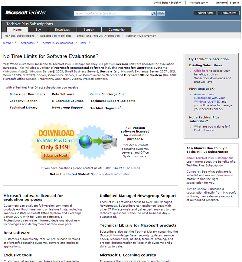
Previous Homepage
The existing site contained too much text, most of which was outdated and failed to convey the benefits of a subscription.
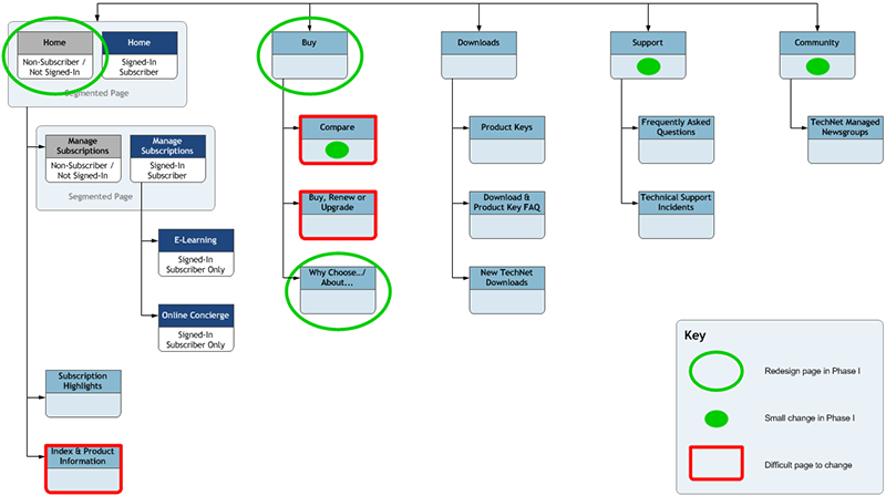
Triage Sitemap
The site needed a complete overhaul, but the client needed something done quickly. I identified three pre-sale pages that could relatively easily be changed, and a few other spots where small changes could be made. For longer-term planning, I also identified pages that would be difficult to change—they used specialized controls built by another group, and we would want to start lobbying for changes to them as early as possible.
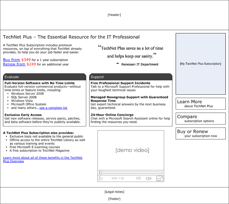
Homepage Wireframe
The primary goals here were to make it clear what TechNet Plus was (a yearly paid subscription service) and what the most valuable/appealing benefits of the program were. Since content was critical to these goals, I wrote new copy for the entire page. Usability tests using printouts of the wireframes as paper prototypes showed clearly better understanding and interest in TechNet Plus.
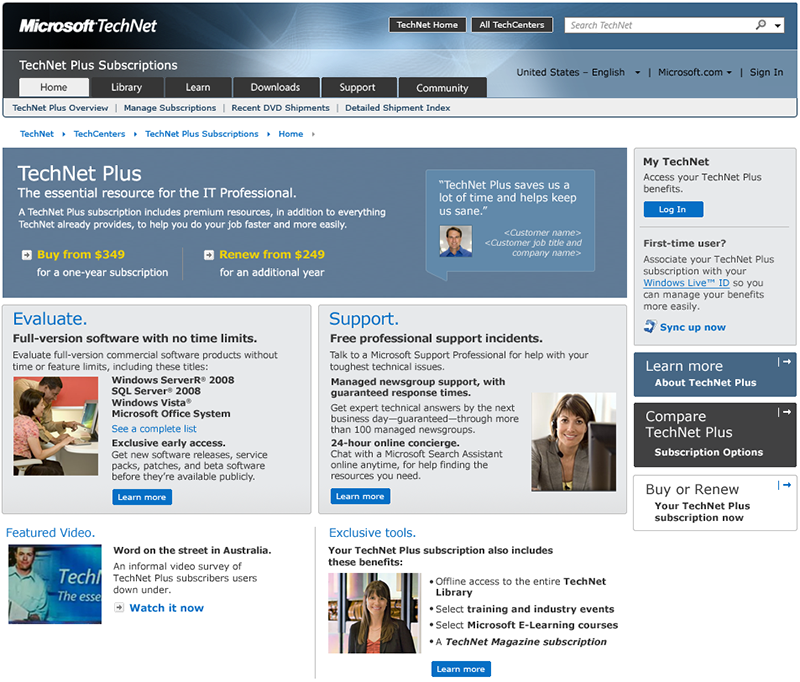
Homepage Comp
Our clients wanted to see more visual punch on the site. Since we had such a short timeframe, I worked with the graphic designer to iterate changes in the comps rather than updating wireframes.
Secondary Pages
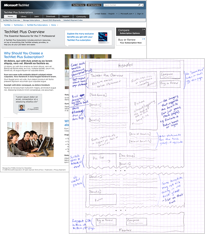
After the homepage, I just sketched quick wireframes and notes for the other pages, and worked with the graphic designer to create comps for the client.
New Homepage at Launch
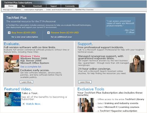
Only the homepage ended up being implemented by the client for the initial launch, but there were immediate results. Subscription orders increased by nearly 300% over the average from the previous 6 month period.
Leave a Reply
Want to join the discussion?Feel free to contribute!