How Not to Be Found by Your Customers
Much has been written on how to promote your brand online, including how to make your wonderful and engaging online presence also be findable, accessible, and usable. Less has been written about how to hide from your customers to keep them from hearing what you have to say. While the latter may have a fairly niche audience, in the spirit of the long tail, here’s some advice on how to not be heard by your customers, using Tazo Tea’s site, tazo.com, as a case study.
First, a bit about Tazo. Tazo Tea has been owned by Starbucks since 1999 and generates $1 billion in annual revenue. It is considered a rising star for its parent company and is being positioned to capture more of the $87 billion global tea market. So to be clear, this is not the case of a small company lacking resources to put into building their brand online. Quite a bit of money was put into their website, and all of the tactics I mention here on how to hide from your customers are based, in Tazo’s case, on decisions made in designing the site.

An Easy Three-Step Process
You could certainly keep your customers from learning about your products by just not having a website. But even if you don’t want your customers to find your site, you may still want to have one. Perhaps you want to impress your boss. Or your mother. Perhaps you do want to promote your brand; you just don’t want it to be too easy for anyone. Persistence is a virtue, isn’t it? Whatever the reason, these three steps will keep most of your customers from accessing all or most of your content, while still allowing you to spend a lot of money on a rich, flashy, impressive site.
Step 1: Keep People from Reaching Your Site
Not long ago this could be mostly handled by some good SEO (Search Engine Obfuscation). We now need to consider social recommendations as well, but fortunately there are some things we can do that will handle both.

Start by making your entire site in Flash and not indexible by search engines. Yes, you could have HTML pages that you tell search engines not to index. But by using Flash, you get other benefits, such as not being accessible on most mobile devices. You also retain plausible deniability in case you need it.
Make sure the site is a single Flash file with just one URL for an entry point. People won’t be able to link directly to your product or other interior pages. This discourages people from linking to your site and makes links less valuable to other people, which together can disrupt the virtuous cycle of incoming links. Additionally, this reduces the amount of “anchor text” pointing to your site for just about anything except your company name. While searching on your company name will bring people to your site, searching on any of your product names or related terms will not.
Step 2: Hide Your Site…on Your Site
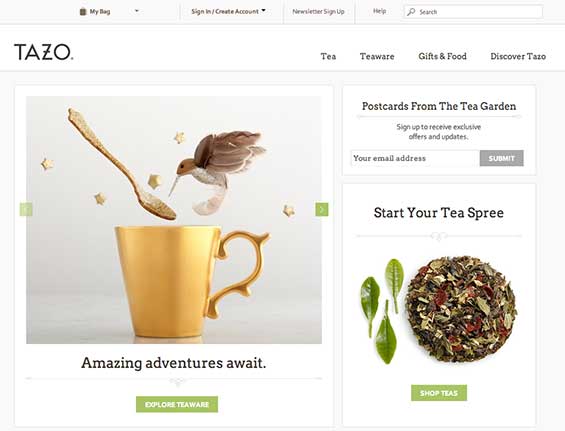
Just because someone’s made it to your site doesn’t mean they have to have reached any real content. Tazo handles this by wrapping up their all-in-one Flash site in a popup window and having the main URL take you to a bare page that does nothing but let visitors launch the popup site.

This makes an extra step for visitors to get from the front landing page to the real site. Tazo has also made this front landing page be almost completely devoid of compelling or branded content. After all, nobody came here for this page. And even if the visitor does “CLICK HERE”, the site probably won’t open since most modern browsers block popups by default.
If anyone questions the need for your site to be in a popup window, just point out how cool it looks. You can include a notice for visitors to turn off popup blockers—Tazo chose to put it in really tiny text—but don’t worry, even if they know how, most people won’t bother to do this.
Step 3: Fall Back and Resist
Despite your best efforts, some visitors will still reach your real site. Have realistic expectations and accept that this will happen. It’s now time to welcome your visitors, dazzle them with the full richness of your brand, and make them fight for every inch of progress they try to make navigating your site.
Hide most of your product and other valuable information behind a navigation puzzle the user must solve. For many sites, this involves confusing and unintuitive categories and labels. For Tazo, this is mainly handled by a crazy, multi-level, pivoting, musical fly-out wheel of navigation that can only be solved with dexterous pointer handling each time the user wants to see your range of products or learn more about one of them.

This part is fiendishly clever. While this navigation puzzle will keep customers from learning more about your products, it will work perfectly for your boss and mother, who will be more interested in just poking around than in finding out about a particular product of interest. Just moving the mouse pointer around on top of the puzzle makes it jump out and spin, looking cool and impressive, and a single click jumps to a product page. The hard part is controlling which product page you go to.
Concluding Thoughts
While pointing out UX issues has become an engrained part of my life, I rarely like to pile on (as I’ve clearly done here,) especially in a public forum. I actually like Tazo, and as a tea drinker in Seattle, I have their teas pretty regularly—whenever I’m in a Starbucks. It was just such a time when I came across this site, trying to find out if their plastic-y tea bags could go in the compost bins. (According to a barista, yes they can. And yes, we have compost bins all over the place in Seattle.)
I thought this was a great example for an anti-case study in large part because Tazo, not to mention Starbucks, is such a large and marketing savvy company. I first paid attention to Tazo because of their ancient, exotic, and completely made up branding, and they’ve been doing some pretty cool, cutting edge stuff like this interactive in-window storefront. Starbucks’ branding and marketing is legendary (or at least infamous,) their website has come a long way in the past few years, and I love their mobile app.
Then here’s this overly-rich, inaccessible website seemingly leftover from 2003. I’m sure nobody at Tazo or Starbucks will lose sleep over my pointing this stuff out. (And if you think I was too hard on them, there’s a lot more I could have pointed out.) I’m sure a complete overhaul is already (somewhere) on the roadmap. I’ll be checking back periodically to see.
***February 2013 Update***
As part of their recent rebranding, Tazo has rolled out a completely new site. It’s a pretty basic website now, without any of the convolution of the previous one. Unfortunately, it also lost most of its charm in the process as their rebranding dropped the rich, textured look for a stark, modern one. Oh, well.
“tub cat” photo by .robbie
Leave a Reply
Want to join the discussion?Feel free to contribute!