The creative power of being a nub

Drawing of Nubcake, who is excited to be a nub

A big thing with my daughters and their friends recently is calling themselves and others a “nub”, (rhymes with “tub”). This is their own version of being a “noob” or “n00b” or newbie. Except for these 8-10 year old girls, being a nub isn’t a bad thing. It’s usually just a thing. It’s neutral. Being a nub just means you’re new at something. Sure, you might not be very good at it, and you might need help, but hey, you’re trying something new. Good for you. Continuing on that line, sometimes being a nub, like in the drawing above, is something to celebrate.
Read more

Case Study: “Regional Travel”

“Regional Travel”* is a travel information and booking service for a region of the U.S. The owner was well connected throughout the region’s travel and tourism industry. The site already had a solid site structure, fairly strong SEO performance, and a large amount of content, especially video and photo assets.

* Names have been changed to protect client confidentiality.

Challenge: Incremental Growth and Balancing Revenue Streams

The site had grown organically over the years and featured a variety of visual styles, far too much text, and a mishmash of technologies. The client wanted to redesign the site to increase revenues and provide a solid foundation for future growth. The business model consisted of half commissions from a local partner travel agency for bookings through the site’s 800 number and half advertising from hotels, excursions, and other travel suppliers. The client wanted to strengthen ad revenue first, which was dropping, and eventually be able to take a larger role in booking to increase that revenue. Meanwhile, SEO needed to improve or at the very least stay the same.

Approach: Focus on the Areas for Greatest Impact

After in-depth discussions with the client, reviewing secondary research he provided, and doing brief competitor audits, I decided to focus on three areas. We came up with a maintainable communication and social media strategy to increase his presence and strengthen SEO for the commercial part of the site. I designed a series of phased page templates for his most important page types, providing long-term targets and intermediary stages to drive self-fueling growth. And I provided guidance and examples for him to use when working with the eventual designers and developers of the site.

Outcome: A Creative Outlet, Plan, and Confidence for the Journey

The blog design has been implemented, and the client has enthusiastically embraced this new channel as well as Twitter. The overall site design, once further phases are implemented, should improve the customer experience, highlight the expert advice and video assets that differentiate him from his competitors, and promote traffic to ad-revenue areas of the site. It also provides additional measurement points to show value to advertisers, beyond impressions and referral traffic to their websites. And what the client found most valuable of all was the confidence he had gained that he understood how and why the various strategies, designs, and guidelines would fit together to help grow his business.

Roles

  • Digital Strategist
  • User Experience Architect
  • Usability Tester
  • Content Strategist
  • Advisor on SEO, Copywriting, and Visual Design

Case Study Gallery

[nggallery id=5]

Case Study: TechNet Plus

Case Study: TechNet Plus

Triage redesign and copywriting that brought record subscription numbers

TechNet Plus is a paid subscription service from Microsoft that includes premium resources to help IT Professionals do their jobs faster and more easily.

Challenge: Patch a Black Hole…Quickly

TechNet Plus wanted to increase the number of paid subscribers. The client had tried direct marketing and a cosmetic site update which didn’t help, and they needed to show some improvement very quickly. I performed a review of the site and secondary research and concluded that by far the biggest problem was that people, even current subscribers, had little idea what the various parts of the subscription really were, let alone what the value and benefits were.

Approach: Triage, Prioritize and Clarify

I identified a few key high-value, easily-changeable pages on the site to make some immediate improvements to. I created wireframes for these, including draft content, showing how to balance:

  • Describing the subscription and letting people dig deeper if they want
  • Prioritizing the most appealing aspects of the subscription
  • Putting these in context of common audience tasks they support
  • Highlighting the value in various ways, such as customer quotes, demo videos, etc.

I conducted a few brief usability tests on the existing site and paper prototypes of the new design, showing clearly better understanding and interest in TechNet Plus.

Outcome: “UNBELIEVABLE” Results

The client implemented just one of the three pages we recommended for Phase I, and even that page was left looking fairly awkward, but there were immediate results. Subscription orders increased by nearly 300% over the average from the previous 6 month period. The clients were incredibly excited and described the results as “UNBELIEVABLE”.


Roles

  • User Experience Architect
  • Usability Tester
  • Copywriter

Previous Homepage

The existing site contained too much text, most of which was outdated and failed to convey the benefits of a subscription.

TechNet Plus existing homepage screenshot

Triage Sitemap

The site needed a complete overhaul, but the client needed something done quickly. I identified three pre-sale pages that could relatively easily be changed, and a few other spots where small changes could be made. For longer-term planning, I also identified pages that would be difficult to change—they used specialized controls built by another group, and we would want to start lobbying for changes to them as early as possible.

TechNet Plus sitemap

Homepage Wireframe

The primary goals here were to make it clear what TechNet Plus was (a yearly paid subscription service) and what the most valuable/appealing benefits of the program were. Since content was critical to these goals, I wrote new copy for the entire page. Usability tests using printouts of the wireframes as paper prototypes showed clearly better understanding and interest in TechNet Plus.

TechNet Plus homepage wireframe

Homepage Comp

Our clients wanted to see more visual punch on the site. Since we had such a short timeframe, I worked with the graphic designer to iterate changes in the comps rather than updating wireframes.

TechNet Plus homepage comp

Secondary Pages

After the homepage, I just sketched quick wireframes and notes for the other pages, and worked with the graphic designer to create comps for the client.

TechNet Plus overview page design

New Homepage at Launch

Only the homepage ended up being implemented by the client for the initial launch, but there were immediate results. Subscription orders increased by nearly 300% over the average from the previous 6 month period.

TechNet Plus homepage launch screenshot

Case Study: NPower

NPower is a non-profit organization that provides IT services and training for other non-profits. The national organization helps coordinate and facilitate the operations of many local affiliates.

Challenge: Transform Charming Locals to Inspiring Network

NPower National hosts the websites of eight of the local affiliates, and was looking to improve the image and user experience of these sites. The existing sites were developed with the intent of being very friendly and approachable, but the staff wanted sites that were also sophisticated and that inspired confidence in NPower. While the local affiliates had started from some common point with their sites, they had moved in varying directions over the years. Many of the differences among sites reflected real differences in the local organizations and the services they provided. Many of the differences…were just different.

Approach: Lunchtime Card Sorts and Main Navigation Counseling

I conducted a multi-site inventory and some guerrilla usability testing (in the lunch room with clients who were on-site for training.) This fed into navigation and labeling systems that would better fit not only NPower’s content, but also what their users were looking for. I created wireframes and comps that showed how to highlight content and provide user navigation in multiple areas, not just the main navigation. I even repositioned the main navigation along the top specifically so there would be a limited amount of space…to avoid future main nav bloat.

Outcome: Visual and IA Makeover on a Flexible Framework

Along with a fresh look, NPower now had a common framework that could accommodate all of the existing content from the various sites as well as be flexible for local differences and future growth. Several NPower employees at corporate and the affiliates really bought in and became advocates for using multiple avenues for highlighting the most important content.

Lessons Learned: Communicate Early and Often

An off site vendor was doing the creative production and the CSS for the sites. We had talked early on and agreed (I thought) on how to work together. The final site design included some unexpected differences from the Information Architecture design, although overall it was still an improvement that the clients were happy with. In hindsight, more proactive and ongoing communication on my part could have made this a more collaborative effort.

Roles

  • User Experience Architect
  • Usability Tester
  • Content Strategy

Case Study Gallery

[nggallery id=3]

Case Study: Microsoft Web

Case Study: Microsoft Web

Award-winning redesign of an intranet portal

Microsoft Web is the main intranet portal within Microsoft, with over 60,000 unique users per month, 75% of whom use the site once or more per day. The site has also grown to host an assortment of content for various business groups, including news, information about the company and about various corporate services.

Challenge: A Portal for the Whole Intranet, “Out of the Box”

The primary overall goals of the project were to increase employee productivity and user satisfaction, and to serve as the premier internal showcase implementation of the latest version of SharePoint—using the software “out of the box” as much as possible. The split nature of the site as portal and content destination was evident in its structure and navigation, with two similar sets of subject categories—one leading to content hosted on MSWeb and one leading to content on sites around the intranet (including MSWeb). This, along with a convoluted information architecture that had evolved organically over time, led to much confusion amongst users.

Approach: Merge, Sort, Test, Repeat…

Rather than try to clarify the portal/content distinction, I merged the two into one. Users didn’t know or care where content was hosted as long as they could find it. Multiple rounds of user testing confirmed this and helped us come up with categories and navigation elements. I created 15 different page templates as well as numerous examples using real content, a high-level sitemap, and reorganized the site inventory of the 900-page site to fit the new model and testing results.

Outcome: Productivity, Satisfaction and an Award

The results were a user-centric site with task-based navigation that let employees spend less time looking for information and more time doing things with it, which led to an 18% increase in employee satisfaction with the site. The Nielsen Norman Group chose the site, based on usability, as one of the Year’s 10 Best Intranets for 2007.


Roles

  • User Experience Architect
  • Usability Tester
  • Content Planner

Former Homepage

The split nature of the site as portal and content destination was evident in its structure and navigation, with two similar sets of subject categories—one leading to content hosted on MSWeb and one leading to content on sites around the intranet (including MSWeb).

MSW Former Homepage

Homepage Wireframes

I left early wireframes very simple, but added more detail as we agreed on some of the basic page structures. The examples above are one of the first and last versions of the home page.

MSW Homepage Wireframes

Wireframe Templates and Content Examples

I created 15 different templates for different types of pages, as well as numerous examples using real content. The annotated content examples helped the client understand how to make use of the templates, in particular by mixing on-page navigation in with content, and how the previously separated portal links and hosted content would sometimes merge on a single page.

MSW Wireframe Templates and Content Examples

High-Level Sitemap

I created a high-level sitemap to show the upper levels of the new site hierarchy and other information, such as which pages contained hosted content, portal links, or both. I tested the categories and labels in multiple rounds with a variety of Microsoft employees.

MSW High-Level Sitemap

Detailed Site Structure

A taxonomist on our team had conducted a site inventory. I rearranged and added fields to the resulting spreadsheet to show the organization of the 900 page site, what templates to use, and recommendations on leveraging the existing content into the new structure.

MSW Detailed Site Structure

Redesigned Site at Launch

The redesigned site met with very favorable reviews and led to an 18% increase in employee satisfaction with the site. The Nielsen Norman Group chose Microsoft Web as one of “The Year’s 10 Best Intranets”.

MSW Redesigned Site at Launch

Portfolio

Portfolio

Here are some recent and noteworthy examples of my work.


T-Mobile DIGITS thumbnail

Case Study

T-Mobile DIGITS

Designing an enhanced iOS phone and messaging UI

  • Illustrator
  • InDesign


Case Study

Gonzaga Intranet Research and Strategy

Helping plan and sell an effective new intranet system

  • Research
  • Strategy


Apex Learning Tutorials thumbnail

Case Study

Apex Learning: Tutorials

Designing a new responsive platform for online learning

  • Balsamiq
  • Photoshop


Classmates Registration thumbnail

Classmates.com Registration and Checkout

Auditing and streamlining transactions

  • Illustrator


Case Study

Apex Learning: Credit Recovery

Information design for an online learning company

  • Photoshop


Case Study

Technet Plus

Triage redesign and copywriting that brought record subscription numbers

  • Visio


Case Study

Microsoft Web

Award-winning redesign of an intranet portal

  • Visio

About Me

Hi. My name is Matthew deStwolinski. I’m a UX guy living in Mercer Island, Washington, the most populated island in a lake in the United States.

What I’m like

I’m driven by curiosity as much as anything. (I’m easily distracted by shiny objects.) I love to delve into one subject after another, connecting dots and bringing new insights to what I do. I try to understand what’s behind the UX decisions we make. For example, on multiple projects, I’ve used research into how the eye moves and reacts to light to help inform how information is displayed on a screen.

My passions include helping people, creative problem solving, and making people laugh. You can see why I love UX so much. The first two are integral to what UX is. And a regular sprinkling of funny comments is perfect for bringing teams and stakeholders together and helping to deal with the inevitable obstacles and headaches we run into. I find there are very few situations too awkward for a little silliness.

What I do

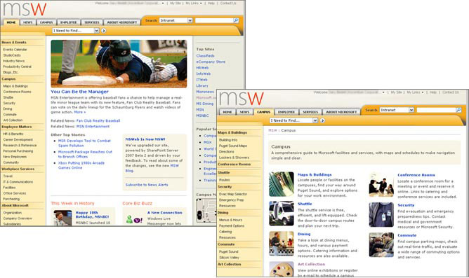
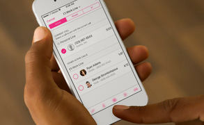
I’ve been a professional UX designer, strategist, and researcher since 2005. In that time, on a wide variety of sites and apps involving e-commerce, social networking, marketing, online learning, internal business tools, and intranets. I’ve been a UX team of one working out of my home, and I’ve worked with over a dozen other designers on a single project. I’ve been embedded in full scrum teams, and I’ve worked in agencies delivering polished deliverables to clients. Recently, I was the lead for a team of six other UX designers.

If that doesn’t make sense…

I make apps and websites easier to use.