You’re a promoter. Don’t forget it.

Promotion is at the heart of what we do as designers. At each stage in the design process we make decisions, conscious or not, that affect what we’re promoting. When we remember this, we can craft sites and apps that effectively guide users through the experience. When we forget, we distract our users from what’s most important.
Every piece of content, every bit of functionality, and every visual element are competing for the user’s attention. You can try to manage that attention by choosing what to promote and how much to promote it. This starts when you define the scope of your project. It continues when you determine the structure, navigation, and interaction models of your site or app. And it carries through to the final layout and design of individual pages, states, and screens.
Scope
When you decide on the scope for a project, you’re setting the stage for what you’re promoting in two ways: you decide what to promote by what you include and how much you’re able to promote things by what you leave out. The more features and content you include, the greater the noise, and the less anything can stand out. In contrast, a light, single-purpose app or site is able to promote its main use much more effectively. Breadth and variety of content and functionality can have value, of course. Take Amazon and Photoshop, for example. Both contain a lot of stuff, and they seem to do fine. But having more stuff comes with the price of it being harder to make any one thing stand out.
Sometimes just shifting how you’re thinking of the scope can help. An education client of mine wanted to include information on their site about places for students to study. There was a lot of discussion about what was or wasn’t a “study place.” Is that outdoor bench around the side of the library a study place? What about the tables in the on-campus coffee shop? These were the wrong questions. Instead of asking, “What is a study place?” I recommended they ask, “What do we want to promote as a study place?” Reframing the question made it much easier to answer.
Structure, Navigation, and Interaction
When you define the structure of your site or app, and you determine how people are going to find things and make use of them, you’re again determining what to promote. Any given piece of content or functionality can go from standing tall by itself, prominently displayed for all to see, to huddled together with a host of others, buried three levels deep under “miscellaneous.” And it’s all relative—you can’t promote everything. So do you treat everything on a level playing field? Or are there certain elements that are more important or desired that you promote above others?
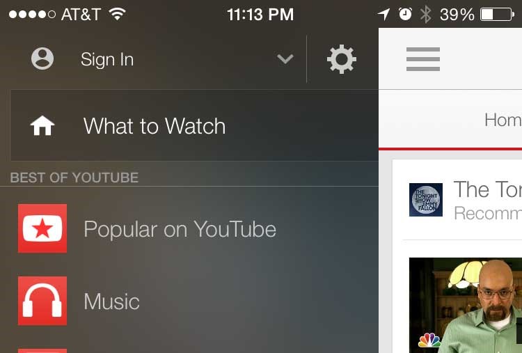
For example, consider the controversial hamburger menu, the icon of three horizontal bars that’s typically used to hide away your main navigation menu.


Peek-a-boo! Oh, I wasn’t signed in.
Even if users know what the icon represents (which is a problem in itself), they’ll still interact with the contents of the menu less than if it was all laid out in front of them. Out of sight, out of mind. By hiding the menu items, you’re choosing not to promote them.
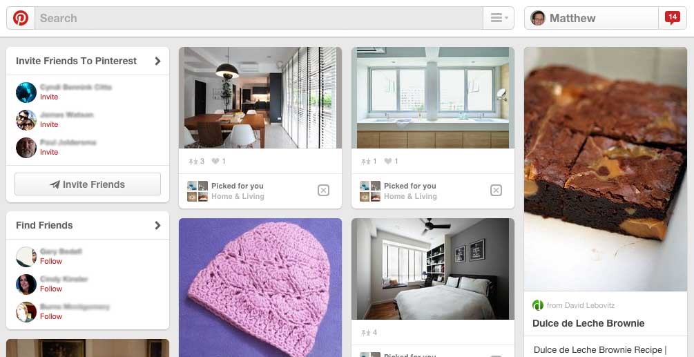
This is fine if the menu items aren’t that important. But for most sites and apps, the main navigation categories are fairly important. And some sites have gone as far as hiding the search field and the registration button. It makes for a clean look, but it’s out of sync with how important these elements are. In contrast, look at Pinterest. You can tell by the front page just how important various activities are to them and their users.

Pinterest manages emphasis very intentionally on their front page. Mmm … brownies.
The vast majority of the page is occupied by recent content from the people you follow, which is what people want most of the time. Next is finding/inviting friends, and then search. Among the least prominent things on the page is a hamburger menu, behind which lie Pinterest’s general categories of content. These categories take up a lot of space and are rarely used. You could argue that a better label could replace the hamburger icon or that it shouldn’t look like part of the search field, but the fact that these categories are hidden (yet still available) is completely in line with their lesser importance.
Page Design
Every screen or page you design has a visual hierarchy, whether you intended it to or not. This is the implied importance given to each element on the page, determined by the similarity and contrast of aspects such as color, size, shape, spacing, location, and alignment. These aspects of the design influence what people are likely to see first and how important they think each element on the page is. This intuitively makes sense, yet it’s easy to forget about this impact of a design and focus just on what looks good.
I liken parts of a page that really stand out to the interface yelling at the user. This could be an oversized logo incessantly yelling who you are. It could be a call to action shouting at the user to register. Or it could be 30 different things all yelling at the same time in an ineffective, cacophonous din. Beware of this, and try to keep your interface talking at the right volume about the right things.
Conclusion
The most important part of being a good promoter is just remembering that that’s what you’re doing. As you go through a project, be mindful of the intent of the design and make sure you’re making the most important things the most important things. Make this a habit, and you’ll be a much more effective promoter and designer.
This post was originally published on the SMITH blog.
Megaphone 1922 photo by Thomas H Ince courtesy of the Wikimedia Foundation.
Leave a Reply
Want to join the discussion?Feel free to contribute!