How to use inconsistency for a better user experience

Consistency in user experience brings many benefits, from making things easier to learn for new users, to giving a more polished and intentional look to your site, to taking fewer resources to create and maintain. Like all good things, however, consistency can be taken too far. Consistency is at its best when balanced with the important need to be inconsistent at times.
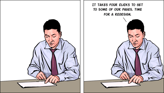
Recently, I’ve noticed a disturbing trend in design conversations that goes like this:

While consistency is very valuable, it’s not an argument-ender. “That’s not a consistent experience” needs to be followed by “…so let’s look at the costs and benefits of introducing this inconsistency.” Consistency absolutism can be easy to fall into, but nobody really wants absolute consistency across the board, at least not once they think about what that would mean. Like many absolutes, this can lead to ridiculous extremes, and like most absolutes, it’s fairly easy to disprove. At the extreme, the most consistent site I can imagine would just be a blank white page. For a smaller and more reasonable scope let’s look at buttons.
Should all hyperlinks look alike? It’s almost universally accepted that it’s okay to use both text links and buttons, among other UI elements. Likewise, most all would agree it’s okay to have different labels for buttons that do different things, although it’s usually best to use consistent labels for buttons that do the same thing. Should the buttons all look alike other than the label? Only if they’re all about equally important. Highlighting particularly important or valuable buttons somehow can be quite useful, although typically you want to keep the variety to a minimum with two or possibly three versions.
Consistency with Judgment
This is my rule of consistency:
Be consistent unless you have a good reason not to.
At first sight, that might not seem like much of a rule, so let’s take a deeper look at it.
The main point of the rule is to avoid inconsistencies that just happen, whether it be from carelessness, different contributors, organizational silos, or change of direction over time. Under this rule, the default is “be consistent.” Only vary from that if you intentionally choose to. You shouldn’t ever have to argue for consistency; you should have to argue for introducing inconsistency.
You shouldn’t ever have to argue for consistency;
you should have to argue for introducing inconsistency.
That leads to the second point of this rule, that inconsistency requires a good reason. “Well, what is a good reason?” you might ask. Good question. I’ll go into some good reasons to be inconsistent in a minute, but let’s make one thing perfectly clear: it’s a judgement call as to what’s a good enough reason, and it will depend considerably on the circumstances and on the costs of introducing that inconsistency.
Any rule that attempts to overly simplify this or take too much of the judgment out of this decision will just be flat-out wrong. There are a lot of factors that go into the costs and benefits of inconsistency. Even if you know all the consequences, it’s still often weighing what’s more important. For instance, do we go with consistency to make the site/service easier to learn to use? Or do we introduce some inconsistency that streamlines some user flows?
My intent here is to provide a useful tool for dealing with inconsistency. It’s easy to remember. And it’s fun to use if you run into a consistency absolutist. Its unexpected simplicity usually gets at least a smile, and it sets the tone for further discussion.
What Do You Mean by Consistency, Anyway?
Good reasons to be inconsistent are coming, I promise, but first let’s look what consistency in user experience means. Consistency involves a uniformity, agreement, or coherence. Inconsistency involves breaking this consistency in some way(s). For a user experience, these can show up in many ways.
Areas for Consistency
Just about any aspect of a user experience can be consistent or inconsistent. This UX Booth article gives one useful breakdown of areas to look for consistency. This article preaches only consistency, and could be improved by a nod to inconsistency, but the buckets it breaks things down into seem useful.
- Elements. What things are on the page, such as header, footer, or navigation.
- Design. What things look like, from the color of links to the tone of imagery used.
- Content. What information you provide, including written, spoken, and visual. Consistency here can range across aspects like terminology, grammar, length, and tone.
- Interaction. What the user can do, how they can do it, and what happens when they do, from the particulars of UI elements to the flows users follow throughout the site.
Scopes of Consistency
We can look at consistency across any number of scopes, including variations by location and over time. Here are three basic scopes of consistency.
- Internal. Across a site or application. This can be either across multiple areas at one time, or looking at one area changing over time.
- External. With other well known sites and applications. Consistency with established patterns and conventions make your site easier to use. Remember Jakob Nielsen’s law of internet UX, users spend most of their time on other websites.
- Offline. Beyond the computer. This can be consistency with an analogy or metaphor, such as the shopping cart. This can also be consistency with real world objects, relationships, and processes, such as aligning categories of an online store with departments of its brick and mortar counterparts.
Good Reasons to Be Inconsistent
In general, it’s good to be inconsistent when it better fits the circumstances. This can show up in one or more of the following ways.
1. It better fits the context of the user
A common example advocating for inconsistency in content is how a healthcare site should use different terminology and tone in its content for doctors and patients. Not only is there a difference in how each audience talks about and understands the subject area, but there’s a huge difference in their emotional state and relationship to the subject area.
Another example is found in web search results. Google, and other search engines, present specialized results for various types of search terms. For instance, the name of a movie that’s currently in theaters brings back local showtimes, ratings, a trailer link, and other information. Most people searching on a current movie, they’ve found, are interested in this kind of information. Search on an older movie, and you won’t get this. Similarly, searching on a city name brings back a map, images of popular landmarks, and a list of links related to visiting the city.
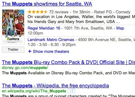
Search results for “muppets”
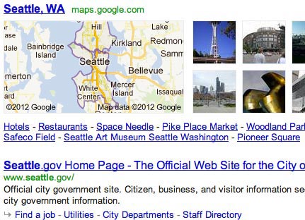
Search results for “seattle”
Google is inferring what the user is looking for based on these types of search terms, and providing more helpful results. They also include things like images, videos, news, weather, and flight info, depending on the search terms.
2. It better fits the goals of the owner
While Google probably won’t admit it, providing the specialized results above also gives them a chance to link to other services they provide, such as their news, image, and flight search results as well as YouTube videos. This is somewhat controversial, but from Google’s standpoint, it certainly makes sense.
Less controversial and much more common is the practice of highlighting main call(s) to action. Sometimes this overlaps with the main goals of the user, and sometimes it doesn’t. In any case, this type of inconsistency has been repeatedly proven to work.
3. It better fits the content
There are often benefits to presenting different types of content differently. You may have a variety of content types that have different aspects to highlight, such as the many product types Amazon has. You may also have a fairly consistent aspect that you need an occasional exception to. For instance, there are numerous blog-style sites that use a fairly irreverent editorial tone across most all of their articles. On occasion, they’ll deal with a more serious subject, such as helping a charitable cause or announcing an illness or death of someone in the community. In cases like these, it is absolutely appropriate to drop most or all of the irreverent tone.
For another example, look at Pocket (formerly Read It Later.) The service allows you to save articles for later reading, which it typically presents in a simplified format that’s optimized for reading. You then have the option of returning to the original source. For pages that it detects as being a site home page, it skips the simplified format and takes you directly to the original source. While users may have the same intention, to read the content on the page, home pages tend not to be rendered very well in Pocket’s simplified reading view.
4. It better fits the context of the device
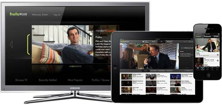
Hulu uses separate UIs for different types of devices
This has become pretty well covered in the past few years, at least in the need for mobile experiences to differ from desktop ones. Remember, though, that for mobile devices, it’s much more than just adapting to different screen sizes and input methods for various devices. The context of the user will often be quite different sitting at a desk, sitting on a couch in front of a TV, walking down a sidewalk, and driving a car.
5. To create contrast, emphasis, or variety
This one is a little different than the first four, and certainly overlaps with them. While consistency has many plusses, it can tend to be boring and not let things stand out from one another.

Mint’s top navigation shows a few levels of emphasis
ESPN splits a navigation bar in two parts using different background colors. This isn’t to emphasize one over the other, so much as to distinguish the two areas from each other.
ESPN’s nav bar differentiates two sets of categories
Sometimes you just want things to be different. On the web, we’ve all certainly seen many boring, monotonous, and consistent lists. Apple stands out to me as the first site I remember that broke away from this on their product pages. Rather than sticking with the typical treatment of each list item having an image on the left and text on the right, Apple varied where the image appeared. Some items had it on the left, and some on the right. If nothing else, this made their pages more interesting to look at.

Left…right…wheeeee!
Conclusion
Consistency, in all its forms, is incredibly important for a user experience. Taken too far, it interferes with your ability to adapt to different circumstances and acts more as a crutch against that more difficult task. As Ralph Waldo Emerson said in his seemingly requisite quote on consistency:
A foolish consistency is the hobgoblin of little minds
Another appropriate version of this, in the form of a contemporary meme, would be:
Foolish consistency is foolish
An effective balance of consistency and inconsistency starts with a reasonable level of consistency, and then intentionally adds in variation to tailor the experience to particular circumstances.
Leave a Reply
Want to join the discussion?Feel free to contribute!