You’re a promoter. Don’t forget it.

man speaking through megaphone

Promotion is at the heart of what we do as designers. At each stage in the design process we make decisions, conscious or not, that affect what we’re promoting. When we remember this, we can craft sites and apps that effectively guide users through the experience. When we forget, we distract our users from what’s most important.

Every piece of content, every bit of functionality, and every visual element are competing for the user’s attention. You can try to manage that attention by choosing what to promote and how much to promote it. This starts when you define the scope of your project. It continues when you determine the structure, navigation, and interaction models of your site or app. And it carries through to the final layout and design of individual pages, states, and screens.
Read more

How to use inconsistency for a better user experience

One sharpened pencil amongst many unsharpened ones
Consistency in user experience brings many benefits, from making things easier to learn for new users, to giving a more polished and intentional look to your site, to taking fewer resources to create and maintain. Like all good things, however, consistency can be taken too far. Consistency is at its best when balanced with the important need to be inconsistent at times.
Read more

How Not to Be Found by Your Customers

Cat peeking out of bathtub
Much has been written on how to promote your brand online, including how to make your wonderful and engaging online presence also be findable, accessible, and usable. Less has been written about how to hide from your customers to keep them from hearing what you have to say. While the latter may have a fairly niche audience, in the spirit of the long tail, here’s some advice on how to not be heard by your customers, using Tazo Tea’s site, tazo.com, as a case study.
Read more

Explore New Technologies But Watch Out For Head Injuries

New technologies change the constraints we work under, enabling new activities and limiting previous ones, easing some and making others more difficult. It takes a while to realize just how much the game has changed, and this period is filled with experiments of varying degrees of success and failure. This is especially true with transformative technologies like the Apple iPhone, its cousin the iPad, and other devices that have followed in their wakes.

Karrie Fransman & Jonathan Plackett have introduced an experimental “tilt comic”, “The First Witch,” that uses the iPhone/iPad accelerometer to move around the comic panel. Here’s a video of the app in action:

I love how they’re using the technology here to push the limits of how we can experience and interact with a particular medium, in this case comics. There’s one point in the video where I cringed, however, as this experimental use of the accelerometer ran into an older navigation paradigm with potentially painful and costly consequences. If you haven’t watched the video yet, I recommend doing so before reading further. Read more

Uhhh…How Do I Turn This On?

We were down in Santa Cruz this weekend for a family reunion, (deStwolinski’s unite!) and we stayed at a lovely hotel nestled away in the forest hillside. Everything about the weekend was spectacular, except for one thing that kept bugging me. One thing that over three days and two nights became, at least in moments when I was feeling a little extra dramatic, my nemesis: the bathroom water faucet.

The mystery faucet

Now, I’m a reasonably intelligent grown man; I’m fairly good at manipulating physical objects and understanding how they work; I study and practice design and usability for a living; I’ve successfully used a wide variety of water faucets; and I’m even somewhat familiar with the inner workings of faucets as I’ve repaired and installed a few. So why can’t I figure out how to turn this stupid thing on?

Read more

The Rest of the World Is Not Like You

We know that other people are different than us. And I’m not just talking about how some guy in a small rural village in India is different than me, (although we probably both do like a nice tandoori naan.)

Any user experience-minded person (or Tron geek) has heard over and over: “you are not your user”. Still, that’s an easy thing to let slip now and then.

Here’s a nice reminder and example from Adam Kalsey that the rest of the world is not like you.

On Saturday evening, while sitting at the airport in Orlando, three different people saw my Kindle and asked if it was an iPad. They had no idea what an iPad was supposed to look like.

One person asked if my laptop was ‘one of those new Apple things’. They knew Apple had released something, but had no idea what it was.

Paul and Yoko, if you’re reading this, pay extra close attention. The person who “knew Apple had released something” didn’t know what it was, but they at least knew it was a device from the computer company, not a new remastered recording of “Can’t Buy Me Love”.

A Few Good (Experience) Games

Boys with Hoops

Want to spend a few minutes playing a free online game but tired of ones that blow? Try one or more from the carefully curated list at Good Experience Games.  Mark Hurst, partner in customer experience consultancy Creative Good and author of information overload life preserver Bit Literacy, has been assembling this list for almost five years—games that in his opinion, you guessed it, offer an especially “good experience”.

I recommend a couple of the latest additions.  Sushi Cat is cute and satisfying (and hopefully spayed, given how it reminds me of Bob Barker.  Ahhh, Plinko.)  This Is The Only Level is one bit of cleverness after the next, hidden beneath a minimalist facade.  (It really is the only level.)

He’s also recently added an iPhone game section, including my long-time favorite, Boggle uhhh…Quordy.

So head on over and check out these and some of his other selections, as well as a good UX blog and several other projects he has going on. Just don’t come back complaining if you descend too long into a vortex of well-designed giddiness.

Space Beer, Editable Video Clips, and Misleading the User, Oh My!

Intriguing content? Check. Easy-to-use online video editing? Check. Easy sharing via popular social networking sites? Check. Other than minor details, (like whether people actually want to edit and share snippets of news videos,) what could go wrong?

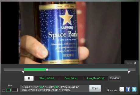
So I checked out MSNBC’s freshly launched update to their online video player, which adds basic video editing to a fairly standard set of sharing options. The editor, itself, is relatively well done. MSNBC kept it simple, allowing you to select a clip out of a video by dragging sliders in from the beginning and end. You get good, real-time feedback of where the video will start and how long the clip is, and you can preview your clip at any point.

To test this, I chose something with almost universal appeal—a story on Sapporo’s new “space beer”. Here’s a screenshot from previewing my clip:

MSNBC's New Video Editing Tool
Read more

Typography Gets a “-pedia” that’s Special

Typedia logo
Do you ever have the feeling there are some incredible typefaces that you don’t know about or just can’t find? Do you have some of your own you want to share? Or are you looking for a better place to express your innermost disgust feelings for  Comic Sans? Then Typedia may be just what you’ve been waiting for.

But wait, there’s more! Typedia is more—well, let’s say ‘different’—than a basic wiki. As the founder, Jason Santa Maria, describes the Typedia site:

Because typefaces aren’t just pretty letters alone, but pieces of art that have distinct criteria, a more specialized tool is needed. The site is a wiki with structure, a “swiki” if you will. We’re dealing with similar subjects and shared parameters, so we can organize the form of that content, as opposed to a freeform essay-style site like Wikipedia.

Whoa! Hold on there. Yes, Typedia has added to the basic wiki framework. Any wiki has structure to it, though, even beyond the obvious parts of ‘pages with titles’ and ‘links among pages’. And his example of a "freeform essay-style site", Wikipedia, is riddled with structure.
Read more

Data-Triggered UX Reviews

I’m currently helping a client with the UX of their data and analytics reporting. In a recent report, an analyst noted that there was a very low and persistent click-through rate from a certain type of product page to an associated store that sells add-ons for those products. The analyst recommended further investigation, suggesting it might be because the store promotion would usually fall below-the-fold.

Not being able to resist, I took a quick look at one of the pages, and in about 5 minutes surmised that it wasn’t so much that the promotion of the store wasn’t obvious, but that a visitor would have to work quite a bit to find a way to get there. The low CTR we were seeing made perfect sense.
Read more